Blog
Speech balloons and lettering basics for manga and comics
The four balloon kinds, captions, sound effects, reading order and tails, lettering in Arabic and Japanese, and why lettering should stay editable.
Published September 23, 2026 · 8 min read
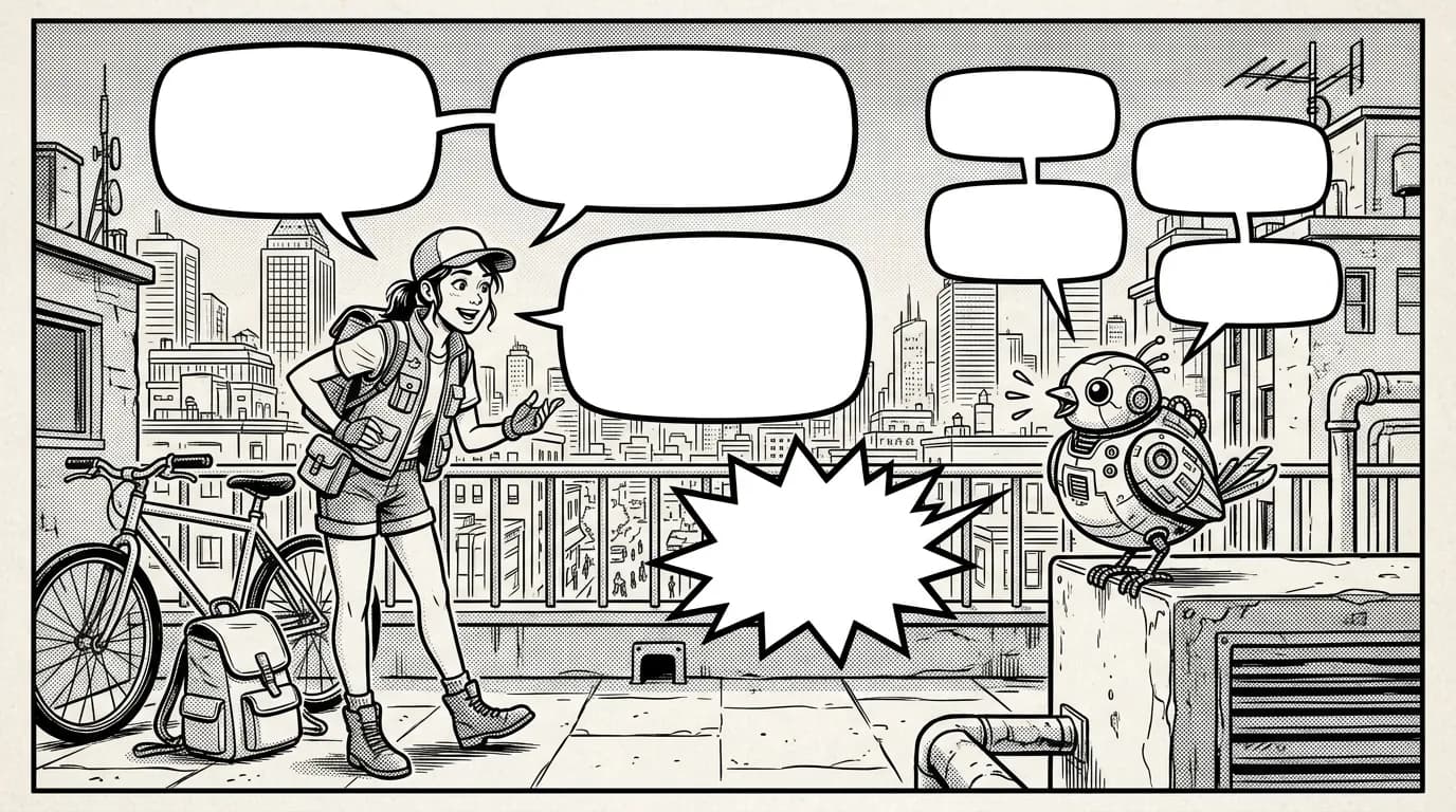
Lettering is everything a reader reads on a comic page: dialogue in balloons, narration in captions, and sound effects. Done well, nobody notices it. Done badly, readers lose the thread, take lines in the wrong order or skip them altogether. This guide covers the basics that apply to any manga, manhua, comic or webtoon, and shows how MangaMade handles each of them.
The four balloon kinds
The outline of a balloon tells readers how a line sounds before they read a word of it. Four kinds cover almost every scene, and MangaMade draws all four:
- Speech: a smooth oval whose tail curves toward the speaker, for anything said at a normal volume.
- Thought: a puffy cloud with a trail of shrinking bubbles instead of a tail, for an inner voice nobody else can hear.
- Shout: a jagged burst with a spiky tail and heavy lettering. Save it for real shouts and screams; used everywhere, it stops meaning anything.
- Whisper: a dashed outline with lighter lettering, for lines said under the breath or meant for a single listener.
A balloon without a tail can mark a voice from outside the panel: someone off screen, a radio, the other end of a phone call. In MangaMade, unticking a balloon’s tail does exactly that, and you can switch any balloon to another kind at any time.
Captions and sound effects
Captions are the narrator’s boxes: time and place (“Three days later”), narration, or a character’s inner monologue. They sit in rectangles, usually against a panel edge, and never have a tail, because nobody in the scene says them. Keep them short: a caption that repeats what the picture already shows only slows the page down.
Sound effects make noise visible: a door slamming, rain on a roof, a punch landing. They are big, bold, often tilted, and coloured to sit in the art rather than on top of it. In MangaMade they are lettering items like the others, each with its own rotation, letter colour and outline colour. The chapter script gives each one a short English hint, such as “impact, large”, that sets its starting size.
Reading order comes first
Readers take a page in tiers, from top to bottom, and inside each tier from the side where reading starts. On a manga page that is the right: the first panel sits at the top right, and inside a panel the highest balloon on the right is read first. Comic and manhua pages start at the top left, and a webtoon simply reads from top to bottom.
Placement follows from that rule. Put the first speaker’s balloon on the side where reading starts, slightly higher than the reply, so a conversation steps down the panel in order. Avoid tails that cross, and never put a later line above an earlier one in the same tier: readers will take them in the wrong order, and the joke or the reveal lands backwards.
MangaMade follows the same logic when it places lettering from the script: tiers from the top, each tier from the reading side. When two items overlap, the one read first keeps its place and the later one moves to the nearest free spot, so the automatic layout starts from a readable order you then refine.
Placement and tails
A balloon should never cover a face, a hand doing something important, or the one detail the panel exists to show. Use the space the drawing leaves: sky, walls, floor, the far side of the frame. MangaMade prepares that space before drawing: each dialogue line and caption in the script is anchored to a panel corner, and the drawing prompt asks the image model to leave room there.
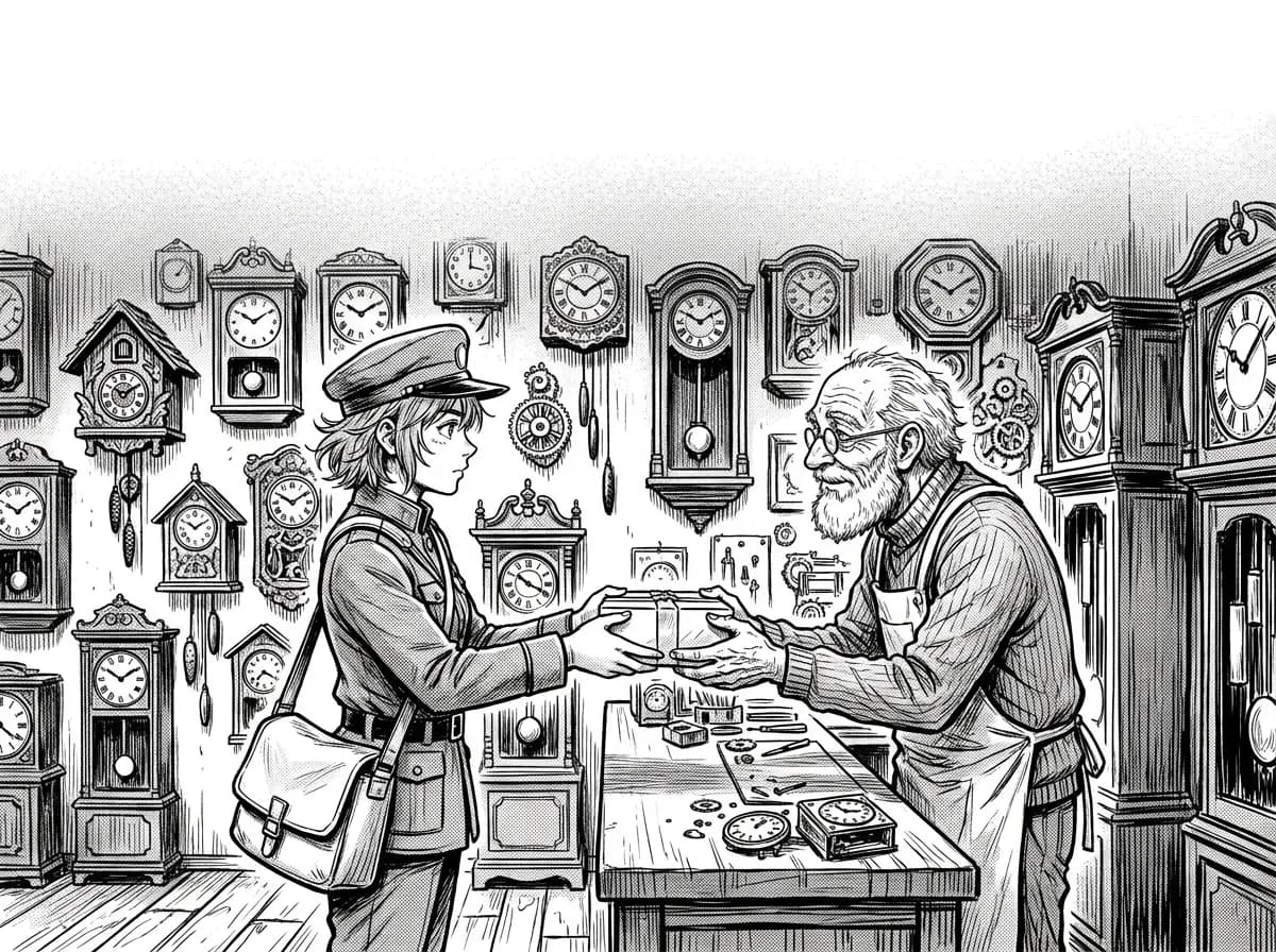
- Aim the tail at the speaker’s mouth, or at least their head, and keep it short: a long tail wandering across the panel is hard to follow.
- When a character says two separate things, two balloons read better than one crowded balloon.
- Keep balloons inside their panel unless the page is designed for them to break the border.
In the MangaMade editor you can drag and resize any balloon, drag its tail tip onto the speaker or remove the tail. On the keyboard, the arrow keys move the selected item, Alt with an arrow resizes it, and [ and ] change which item sits on top.
Fonts and sizes
Comic lettering uses typefaces designed for it, and only a few of them: one for dialogue, a heavier display face for shouts and sound effects, and often a third for captions, so narration never reads like speech. Each MangaMade style preset comes with such a set, and every lettering font is a free, open-licence typeface bundled with the product.
Size matters more than the typeface. Keep dialogue at one size throughout a chapter, so smaller lettering reads as quieter and larger as louder, and remember that a strip read on a phone needs larger lettering than a printed page. In MangaMade, the size you set is the largest the text may use: a longer line shrinks to fit its shape, down to a minimum size. The chapter script keeps lines readable too, with at most three dialogue lines per panel and 35 words per line.
Lettering in Arabic and Japanese
Arabic
Arabic runs right to left and its letters join, so it needs typefaces drawn for it and a few rules of its own. Never add letter spacing: it pulls Arabic letters apart and breaks their joins. Give lines more height than Latin text, for the tall letters, descending tails and dots. And set a line that mixes scripts, such as an Arabic sentence with a Latin name in it, right to left as a whole.
MangaMade letters Arabic and Urdu right to left, with an Arabic typeface for dialogue and a classical naskh face for captions. It takes the direction from the text: an Arabic line that opens with a Latin name stays right to left, a sound effect in Latin letters stays left to right, and you can change any item’s direction in the editor. Page order is a separate series setting, so an Arabic comic can turn its pages right to left too.
Japanese
Japanese manga traditionally sets dialogue vertically, in tall, narrow balloons read from top to bottom. MangaMade letters Japanese horizontally for now, in a Japanese typeface it selects automatically; vertical Japanese lettering is not available yet. A Japanese sound effect, such as ドン in an otherwise English chapter, gets the Japanese typeface automatically too.
A language can be chosen only when the bundled typefaces have all its letters. That rules out Chinese, Korean and Hebrew for now, as well as the languages written in Cyrillic or Greek and a few Latin-script languages such as Turkish and Vietnamese. A manhua can therefore be lettered in English, French or Arabic today, but not yet in Chinese.
Why MangaMade keeps lettering on its own layer
Image models can still garble text: letters melt together and words come out misspelt, and a word drawn into the picture cannot be retyped, only drawn again. So MangaMade draws every panel without any text and sets the balloons, captions and sound effects itself, on a separate vector layer above the art. That separation is what makes lettering cheap to change:
- It starts from the script: every dialogue line, caption and sound effect becomes a lettering item on the right panel.
- It stays in sync: rewrite a line in the script and its balloon follows; rewrite it on the page and the page keeps your version.
- It is free: lettering, layout changes and edits cost no credits, and a typo never costs a redraw.
- It translates: translate a chapter into another language and you get an edition with its own dialogue, captions and sound effects over the same drawings. Nothing is redrawn and no credits are used; a translation counts as one plan in the day’s planning limit.
A quick lettering pass
- Read the page in reading order: every balloon should come in the order its line is said.
- Check that each tail points at the right speaker.
- Move any balloon that covers a face, a hand or the key detail into empty space.
- Check the sizes: dialogue consistent, shouts bigger, whispers lighter.
- Read every line once more for typos; on a separate layer, a fix costs nothing.
Questions this answers
- What is the difference between a speech balloon and a caption?
- A speech balloon holds words a character says aloud, and its tail points at that character. A caption is a box without a tail, for narration, time and place, or inner monologue: words nobody in the scene says out loud.
- In what order are speech balloons read in manga?
- Tier by tier from the top of the page, and within each tier from right to left, starting at the top right. Comic and manhua pages start at the top left and read left to right, and webtoons read from top to bottom.
- Can MangaMade letter a comic in Arabic or Japanese?
- Yes. Arabic and Urdu are lettered right to left with Arabic typefaces, and Japanese is lettered horizontally with a Japanese typeface; vertical Japanese is not available yet. About thirty Latin-script languages, such as English, French and Spanish, are supported too, while Chinese, Korean and Hebrew are not yet.
- Does fixing or translating lettering cost credits?
- No. Lettering sits on its own layer above text-free panels, so editing, moving or restyling it is free, and translating a chapter creates an edition over the same drawings without using credits.
- Can I change a balloon from speech to shout after it is placed?
- Yes. Select it in the editor and pick another kind: speech, thought, shout or whisper. A kind you choose by hand stays, even when the script changes later.
Make your next chapter
Turn your story into lettered pages: model sheets for your cast, AI-drawn panels and exports in PNG, PDF, CBZ or webtoon.
Start free