Blog
Manga panel layout: how to storyboard a page that reads
How to plan a manga page: storyboard first, then choose panel count, size, shape and shots so the reader’s eye follows the story in the right order.
Published October 1, 2026 · 6 min read
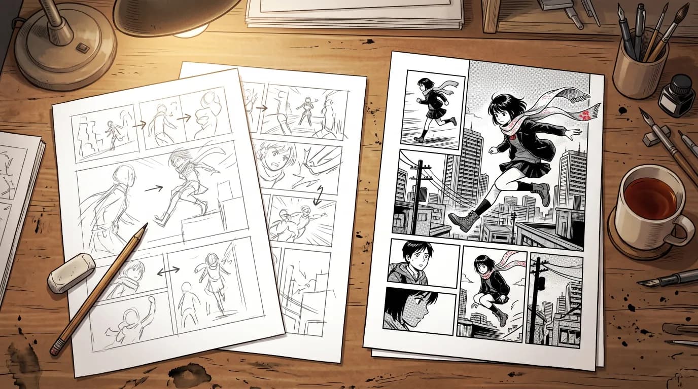
A beautiful panel in the wrong place still makes a confusing page. Panel layout is the part of manga that readers never notice when it works and always notice when it does not: the eye jumps to the wrong panel, a joke lands too early, a reveal is spoiled before the page turns. This guide covers how to storyboard a manga page, how many panels to use, how size, shape and shots control pacing, and how MangaMade’s layout templates put those rules to work.
Storyboard first, draw later
Manga artists plan a chapter as a rough storyboard, often called the name, before they draw a single finished page. It is a planning document, not artwork: loose rectangles for panels, simple figures, arrows for movement and a note of who says what. The point is to see whether a sequence reads while everything is still cheap to change.
- Work small. Thumbnails a few centimetres tall force you to think about the whole page rather than details.
- Plan pages in pairs, the way a printed book shows them, so you know what the reader sees at the same time.
- Read it aloud. If you stumble on the order of lines or panels, a reader will too.
Reading order comes first
Manga pages read right to left. The first panel sits at the top right, the eye moves left along the row, then drops to the right end of the next row, and balloons inside a panel are read right to left too. Western comics and most manhua do the opposite. Whichever direction you use, the reader should never have to guess.
- Keep the gutters between rows continuous, so each row clearly ends before the next begins.
- Avoid a stack of panels beside a single tall one unless the order is obvious; it is the most common cause of a misread page.
- Let the action point the way: a character running or looking toward the next panel pulls the eye there.
- Place balloons in reading order, so the first line said is the first line read.
How many panels per page?
There is no fixed number, but there is a useful range. A typical manga page holds a handful of panels; past six or seven, panels shrink until faces and balloons fight for room. Quiet conversations tolerate more panels, action needs fewer and bigger ones, and a single-panel splash page is the strongest moment you have, so it should be rare. Vary the count from page to page: a run of identical grids reads flat, however good the art.
Panel size and shape
The size of a panel tells the reader how much it matters and how long to stay on it. Shape adds meaning of its own.
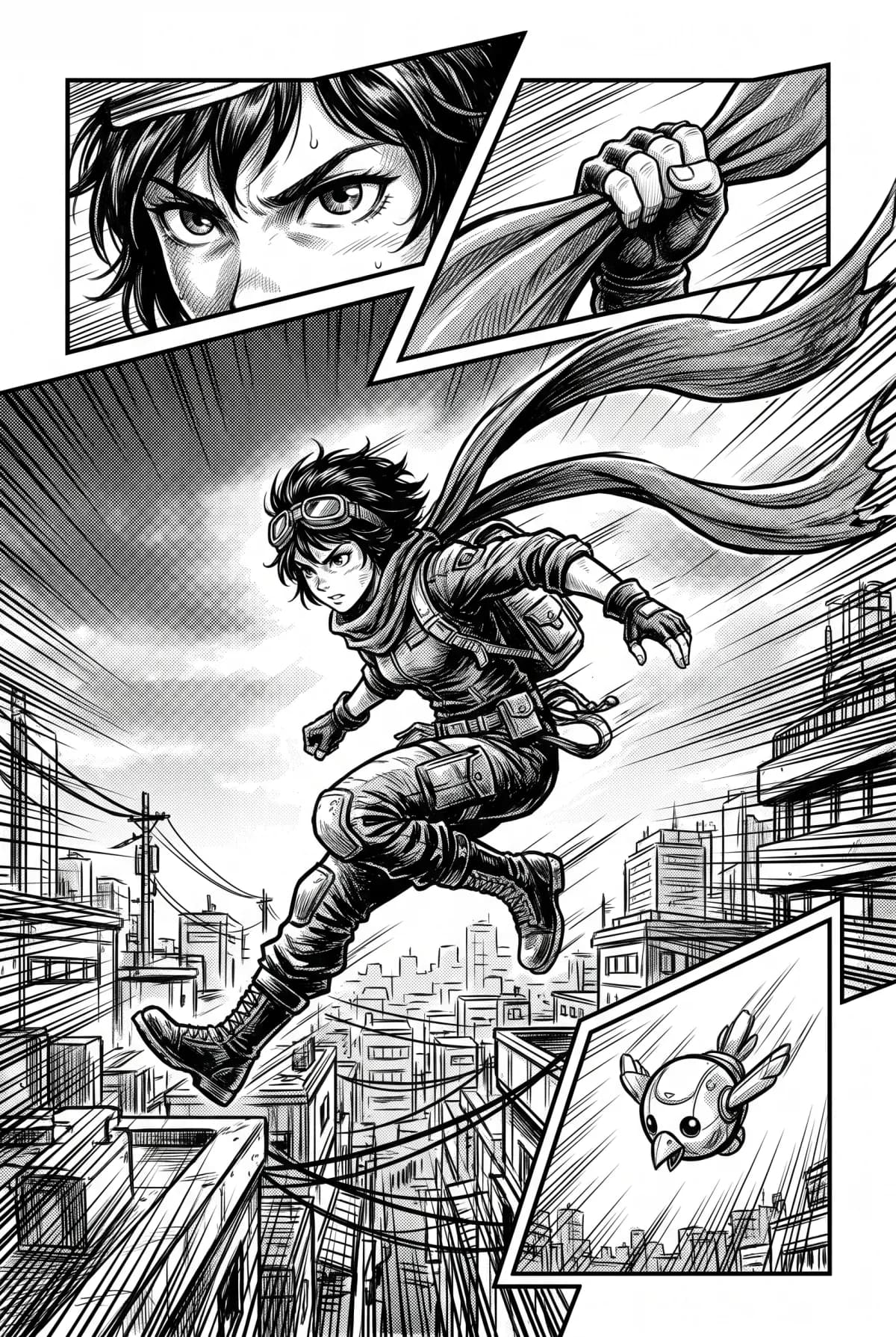
- The biggest panel on the page is its main beat. Decide what it is before you lay out anything else.
- Wide panels suit establishing shots, landscapes and crowds, and slow the page down.
- Tall panels suit height, falls and standing figures, and draw the eye downward.
- Small panels suit quick beats: a glance, a hand, a reaction.
- Slanted borders and art that breaks out of its frame add energy to action scenes, but use them sparingly or the page becomes hard to read.
Shots: vary the camera
Each panel is a camera position. Changing the shot from one panel to the next keeps the page alive and tells the reader where to look. MangaMade’s scripts use eight shots: establishing, wide, medium, close-up, extreme close-up, over-the-shoulder, low angle and high angle.
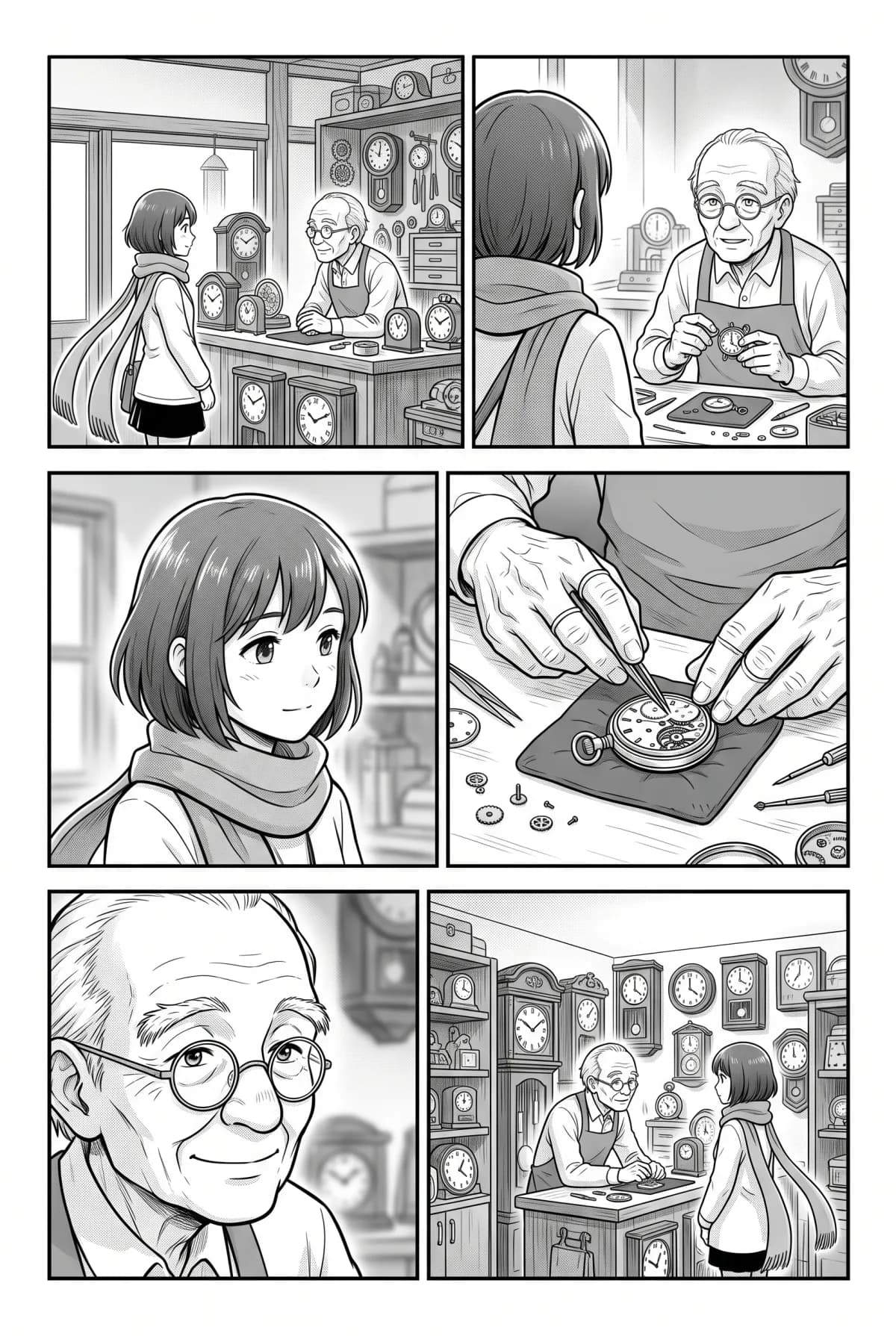
- Open a scene with an establishing or wide shot so the reader knows where they are.
- Use medium shots for conversation and body language.
- Save close-ups and extreme close-ups for emotion and important details.
- A low angle makes a character look powerful; a high angle makes them look small or alone.
Pacing and the page turn
Two facing pages are seen at once, so a surprise placed on them is spoiled before the reader gets there. Keep reveals for the first panel after a page turn, and end the page before it on a beat that makes the reader want to turn: a question, a door opening, a character reacting to something we cannot see yet. Inside a page, alternate tension and release, a run of small panels followed by one large one, so the big moment has room to land.
Leave room for the words
A layout is not finished until the lettering fits. Plan calm space above or beside the speakers, usually at the top of a panel, where balloons can sit without covering a face or the key action. A panel with three speakers and a dense background needs to be bigger than the same shot without dialogue.
Layout templates in MangaMade
In MangaMade, the planner does the storyboarding pass with you. Manga and comic pages are 2:3 portrait pages of 1400 × 2100 px, with gutters, a margin and an ink border around each panel, and every page uses one of eleven layout templates:
- One panel: the splash page, drawn at 2K for 2 credits.
- Two panels, side by side or stacked.
- Three panels: a wide panel over two, two over a wide panel, or three stacked rows.
- Four panels: a grid of four, or a wide panel over a row of three.
- Five panels: two rows of two around a wide middle panel, or a wide panel over two uneven rows.
- Six panels: a grid of two columns and three rows, for conversations.
On right-to-left pages every template is mirrored, so the first panel sits at the top right and balloons are placed in right-to-left order. Each panel is drawn at a shape close to its frame, slightly larger and trimmed to fit, so a picture never leaves a white edge. You can change any page’s template, add or move panels, or change a shot in the script before anything is drawn, and planning is free. The templates use straight, rectangular frames: slanted borders and art that breaks out of the frame are hand-layout techniques MangaMade does not offer.
Questions this answers
- What is a manga storyboard called?
- Manga artists often call the rough storyboard the name. It is a loose plan of every page, with panel shapes, simple figures and dialogue, made before any finished art so the order and pacing can be checked cheaply.
- How many panels should a manga page have?
- There is no fixed rule. A typical page holds a handful of panels, and past six or seven they start to crowd out faces and balloons. MangaMade’s templates go from a single splash panel to a grid of six.
- Which way do you read manga panels?
- Right to left, starting with the panel at the top right, then down row by row. Balloons inside a panel are also read right to left. MangaMade mirrors every layout template for manga so the order stays correct.
- What size is a manga page in MangaMade?
- Manga and comic pages are 2:3 portrait pages of 1400 × 2100 px, with gutters, a margin and an ink border around each panel. They export as PNG pages, a PDF, a CBZ or a vertical webtoon strip.
Make your next chapter
Turn your story into lettered pages: model sheets for your cast, AI-drawn panels and exports in PNG, PDF, CBZ or webtoon.
Start freeKeep reading
- How to make a webtoon: a step-by-step guide for beginners
- How to make a manga chapter with AI, step by step
- How to keep characters consistent across panels
- Manga vs manhua vs webtoon: formats and reading direction
- Speech balloons and lettering basics for manga and comics
- How to export a comic for vertical scroll and for print
- AI art and copyright: what you own when you make comics with AI
- AI manga generator: how to turn text into manga pages